AtWar Fanart - Posters/Lithos
- 1
- 2
Objave: 60
Posjećeno od: 99 users
|
09.08.2013 - 22:39
I decided to make a few posters for AtWar. I put symbolism and the art portions above all else, so if they seem like propaganda or preachy art, you can understand. Anyways, share your thoughts, if I should make more, etc etc. Thank you for reading and viewing, it is very much appreciated. Note: Clicking each image links you to a much larger, HQ version of each image. Series IV 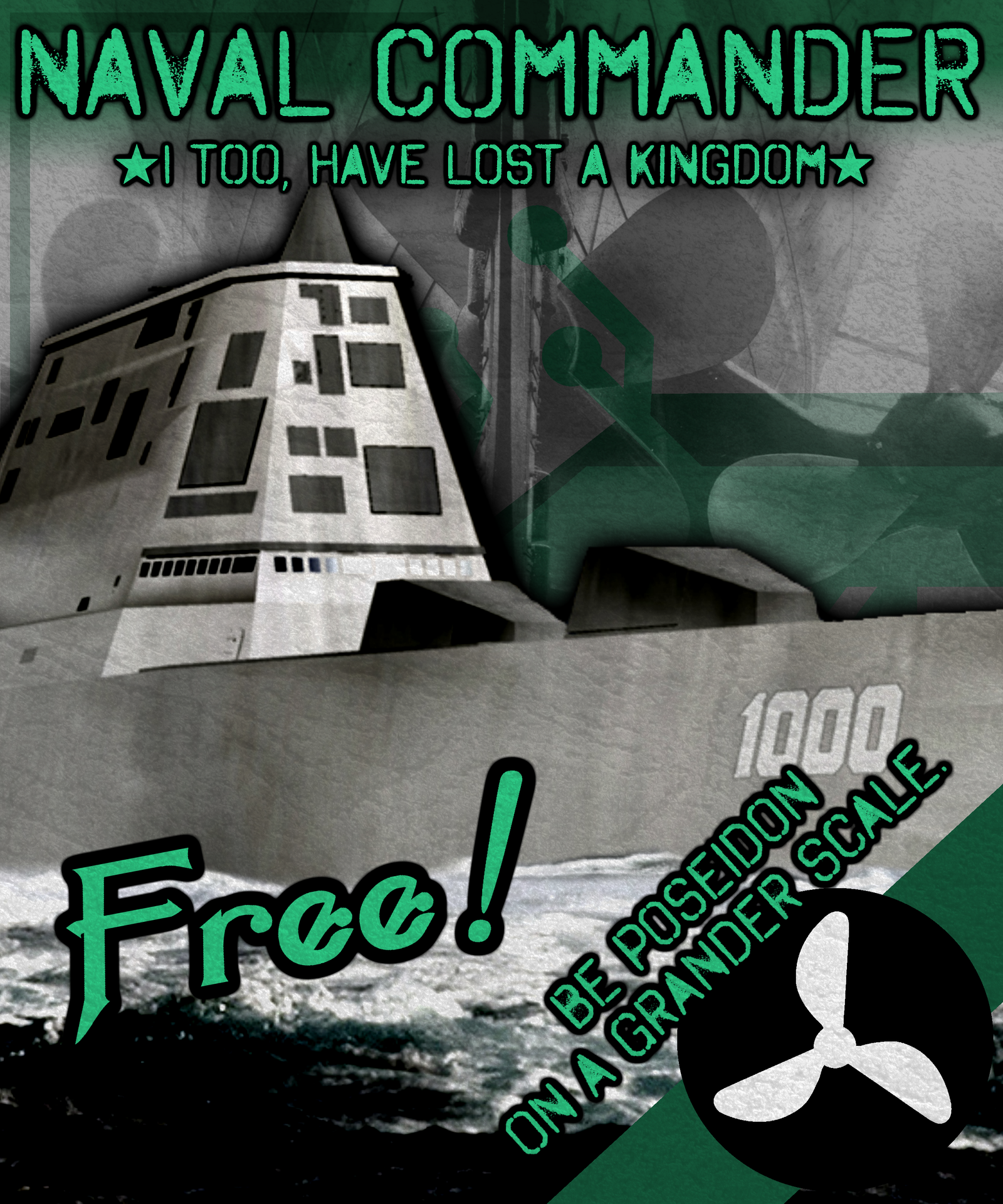 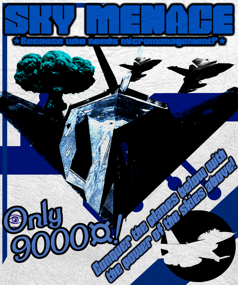 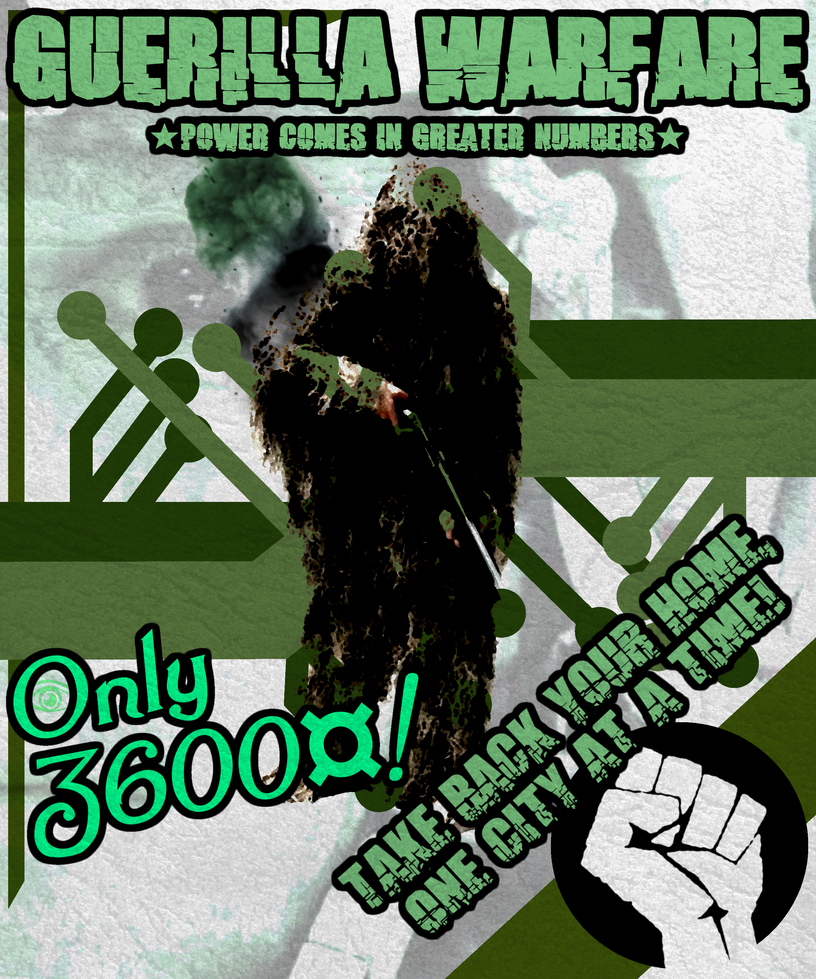 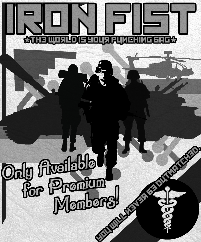 Series III 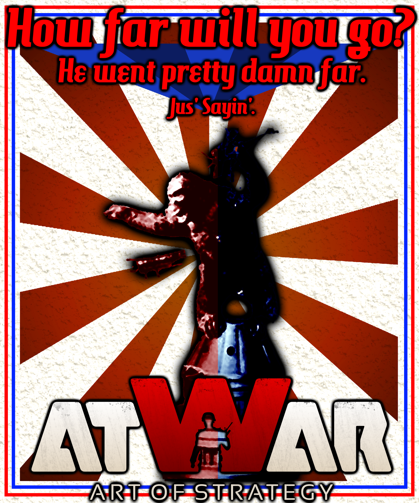 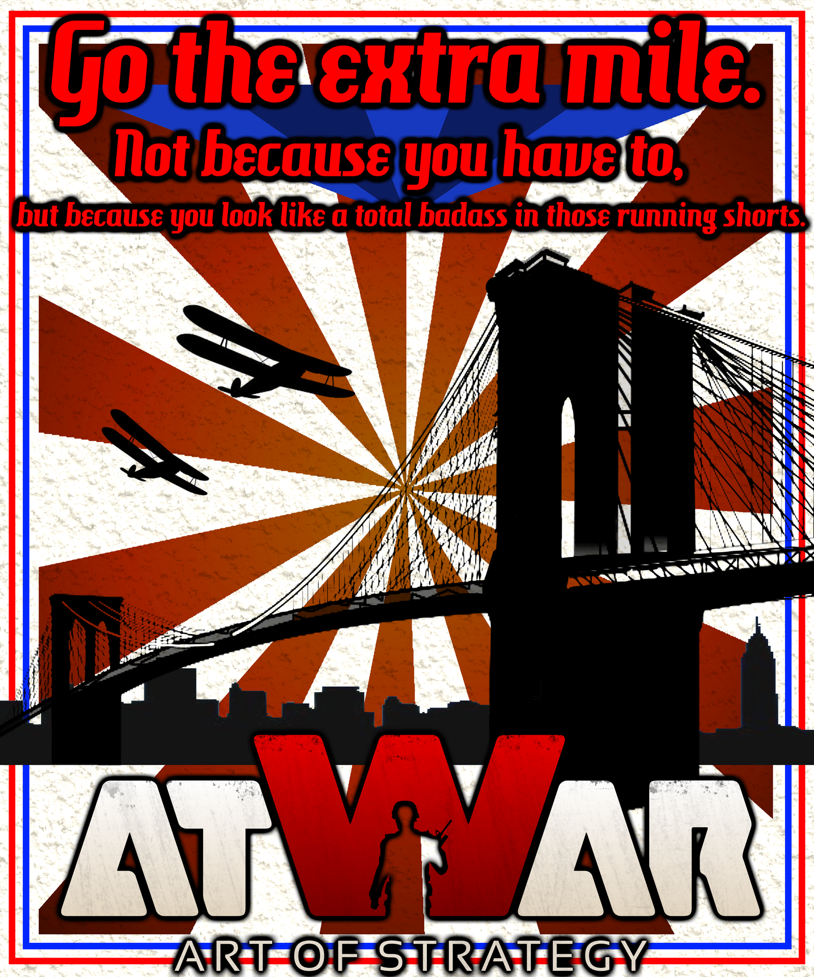 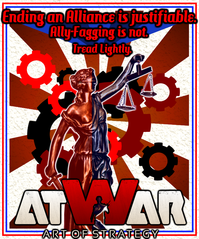 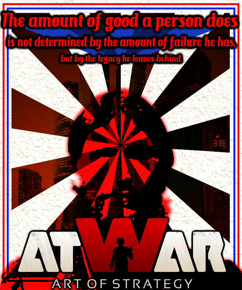 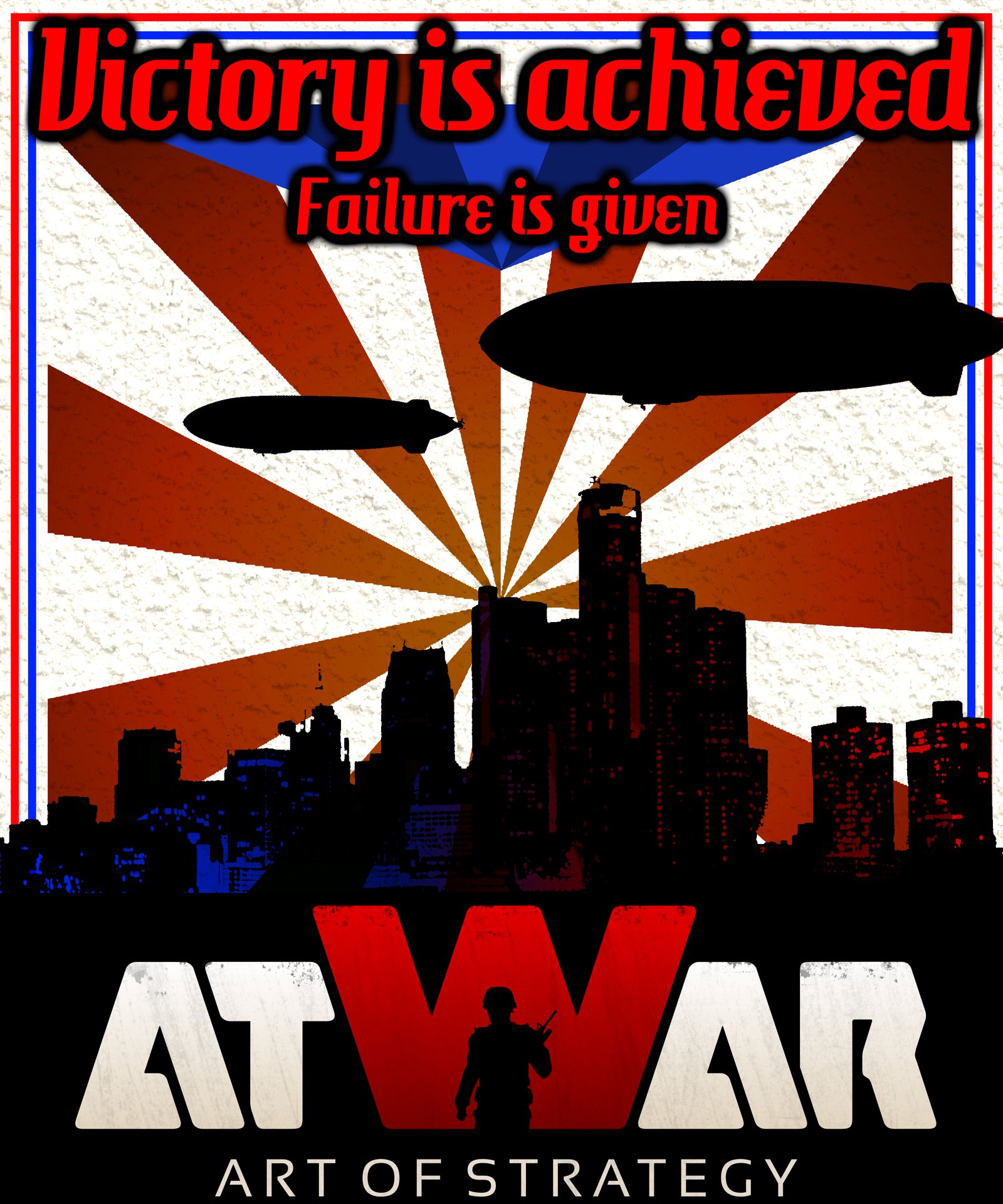 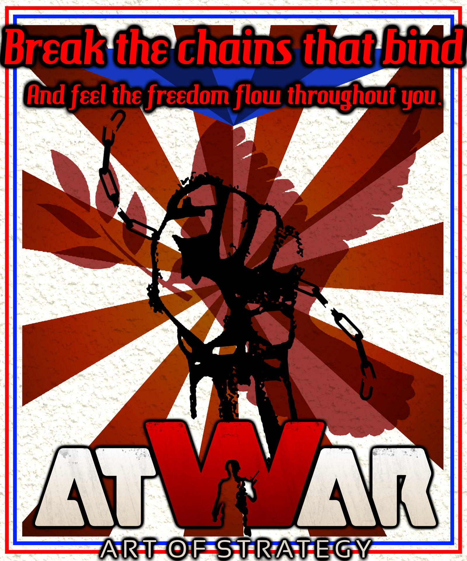 Series II 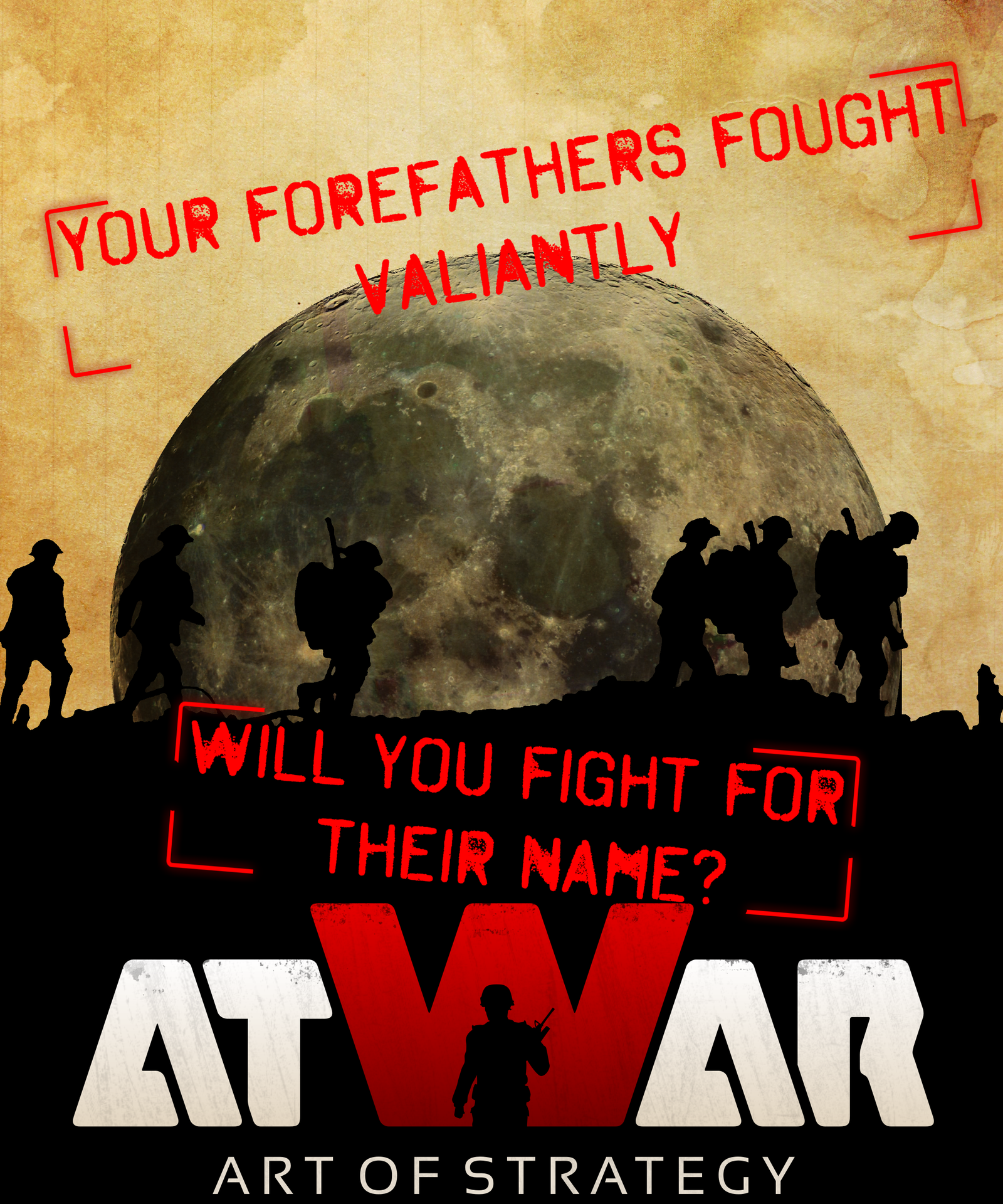 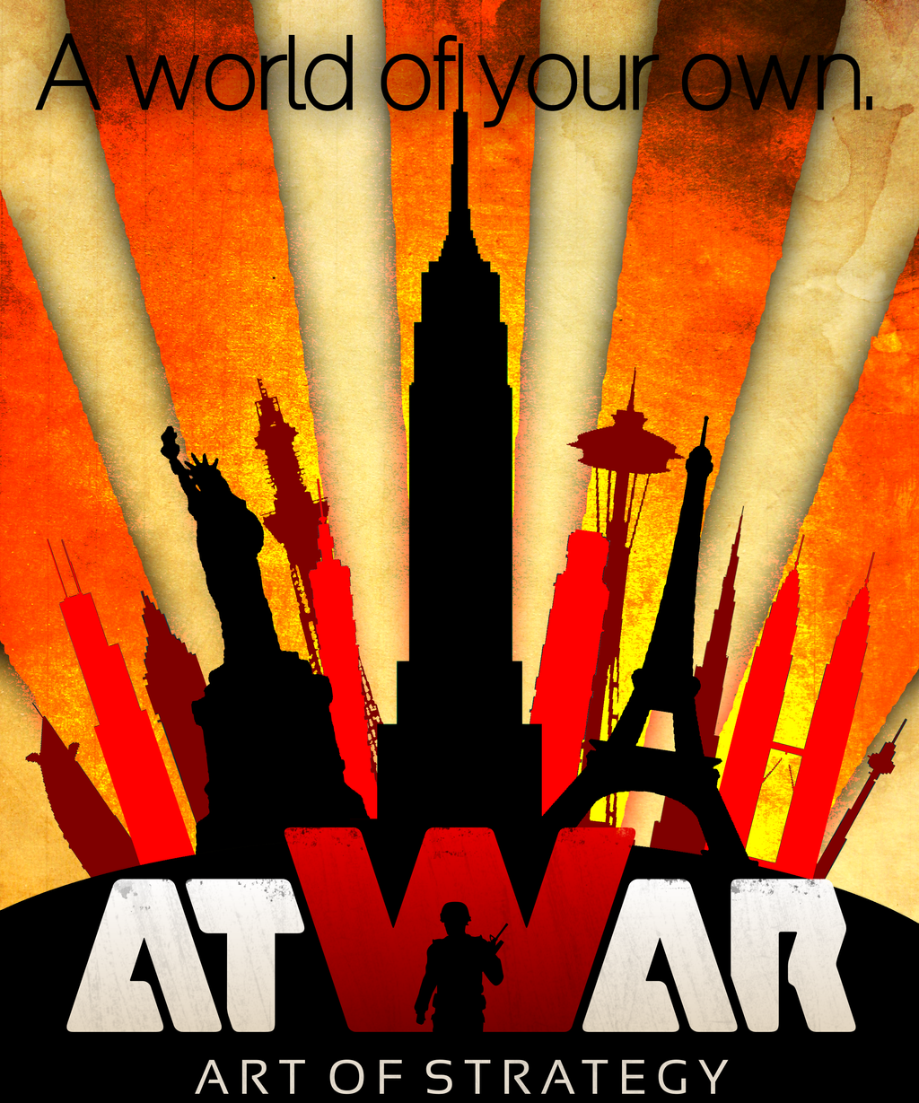 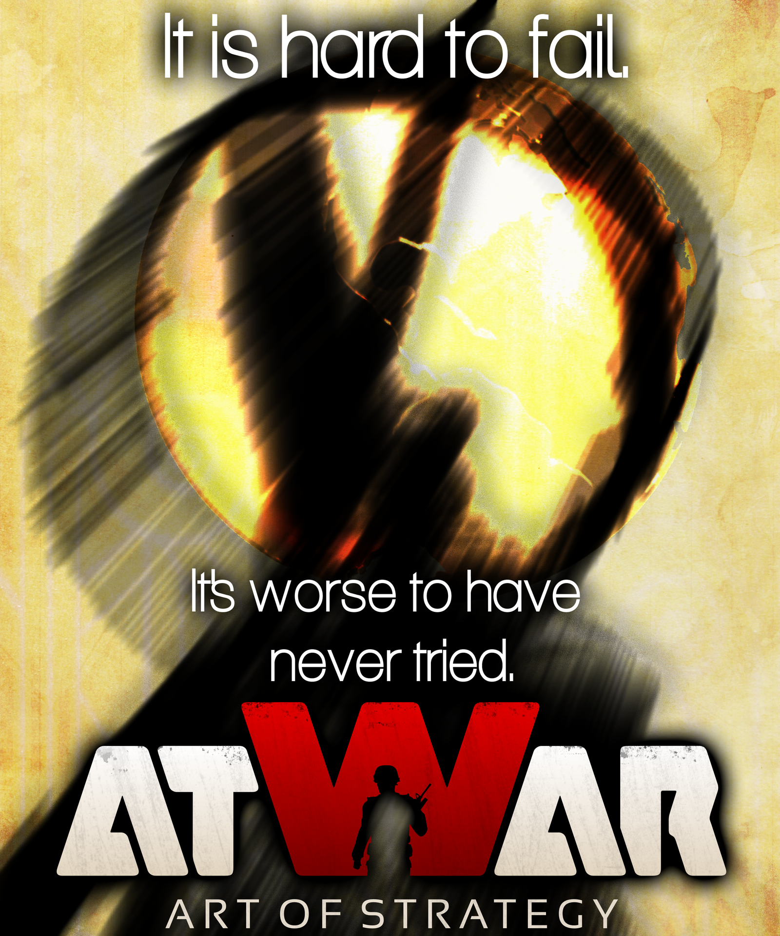 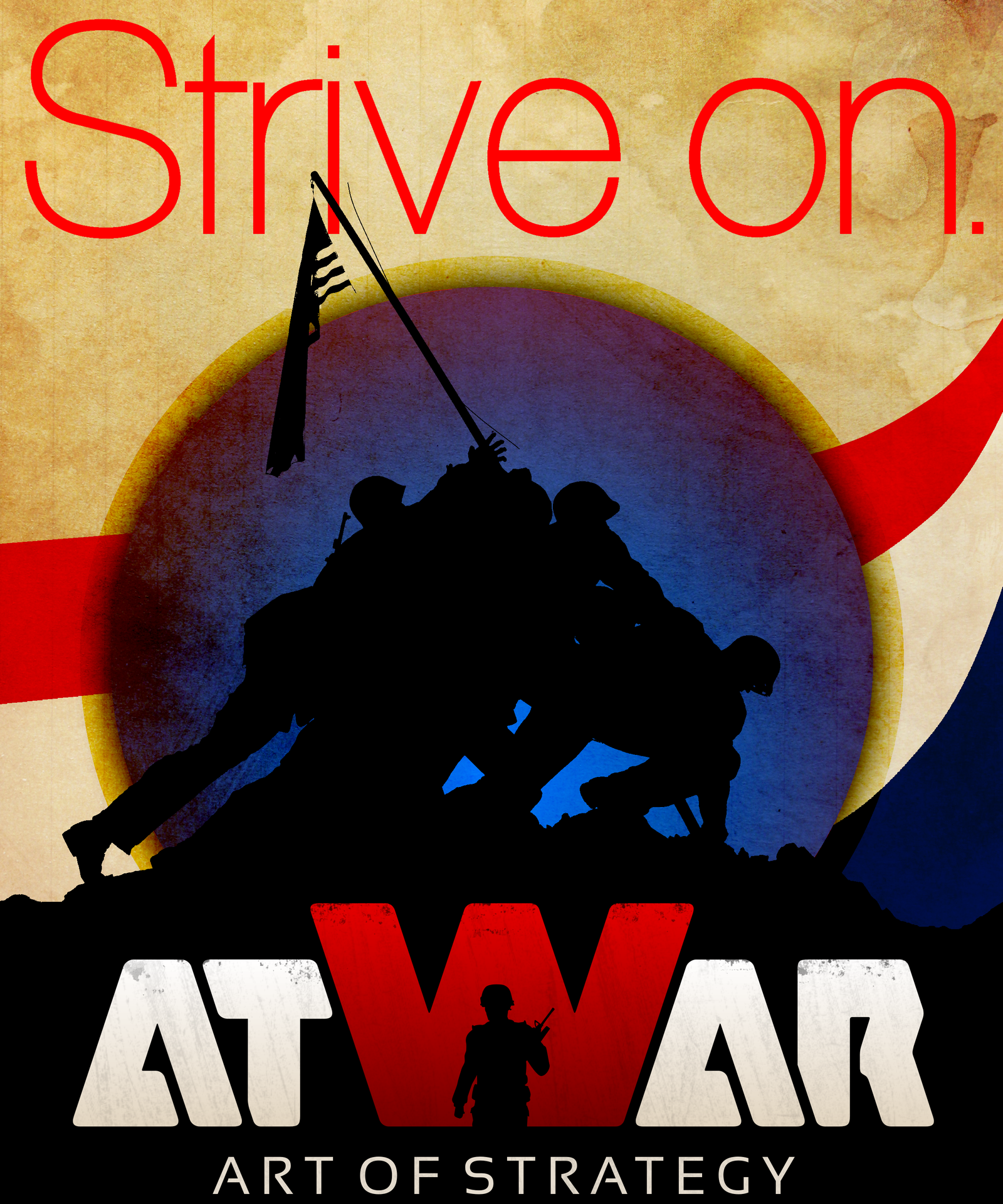 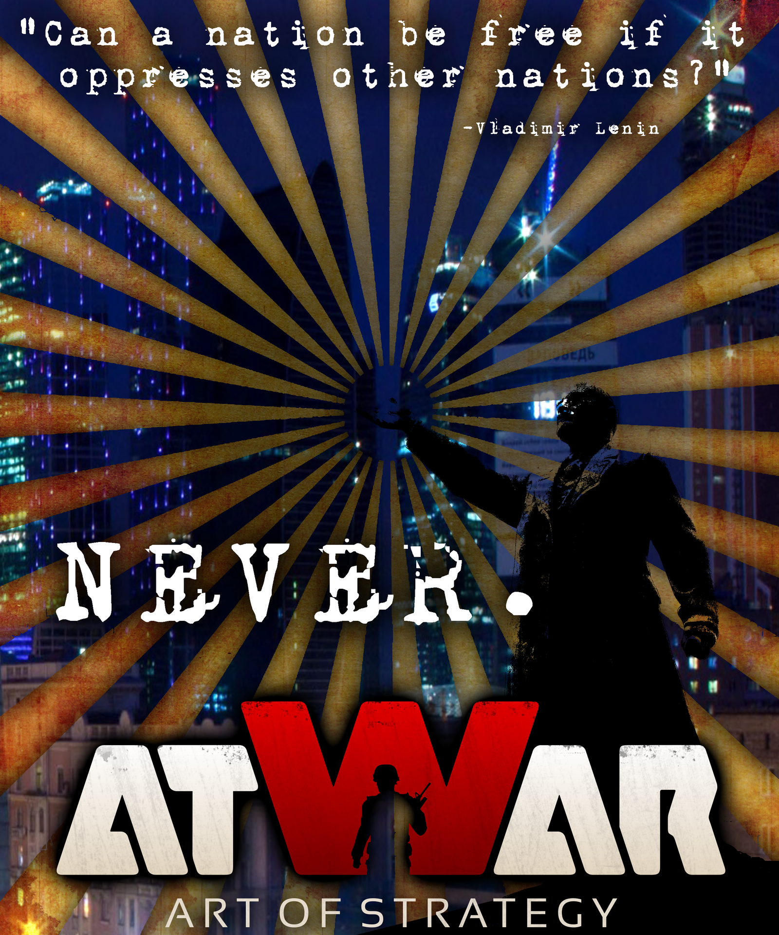 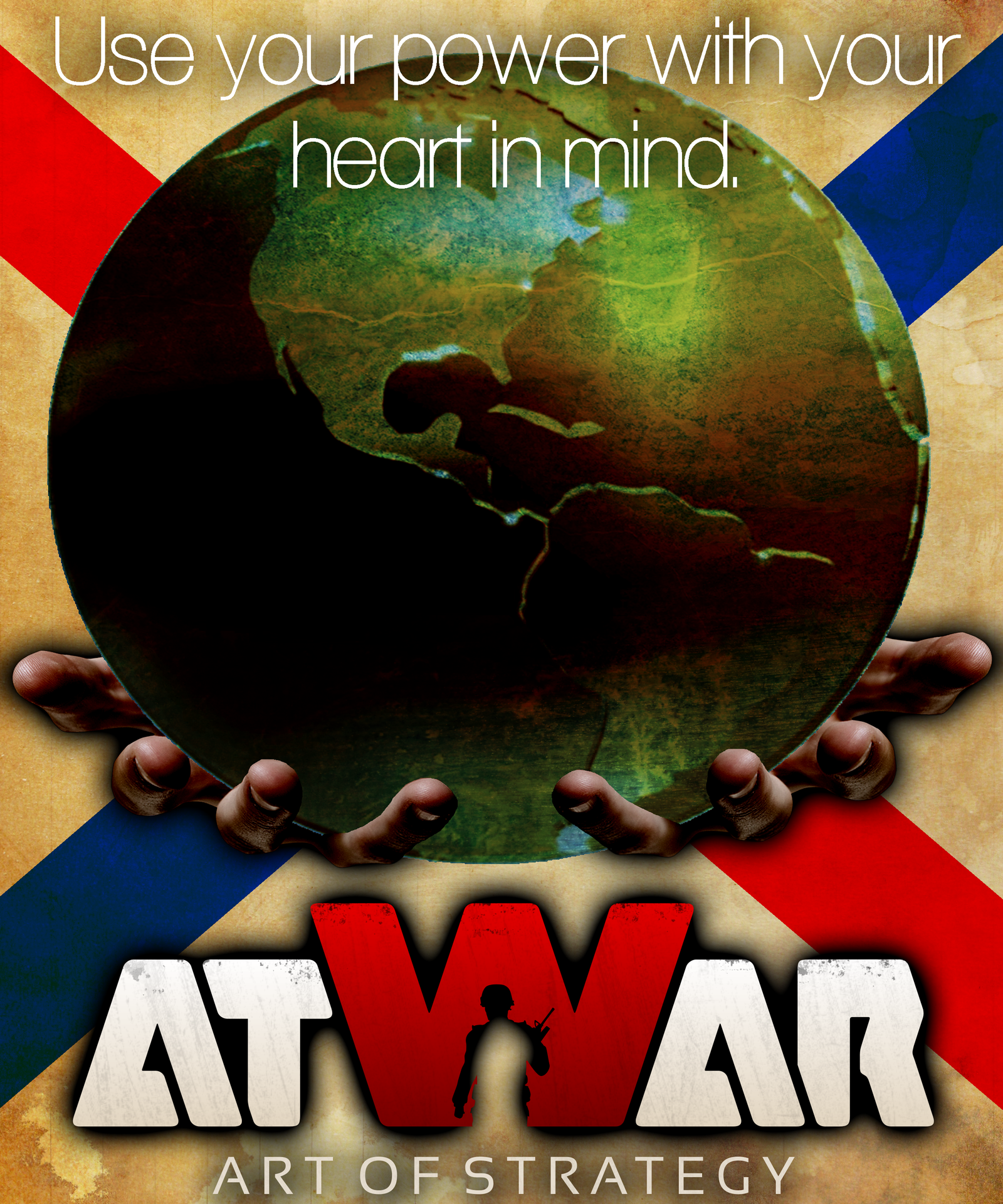 Series I      
Učitavanje...
Učitavanje...
|
|
|
09.08.2013 - 23:16
These are fantastic. If you can make more of this quality then by all means do so; I for one enjoy them. 
---- The church is near, but the road is icy... the bar is far away, but I will walk carefully...
Učitavanje...
Učitavanje...
|
|
|
09.08.2013 - 23:32
Thank you, your words are very appreciated. These three took a mere few hours, so I'll begin another batch as I finish this post.
Učitavanje...
Učitavanje...
|
|
|
09.08.2013 - 23:42
Nice artwork! I also appreciate it a lot. Some ideas:
Again, really nice work! 
---- 
Učitavanje...
Učitavanje...
|
|
|
09.08.2013 - 23:51
Thank you as well. I originally wanted to make something similar to the old Star Wars posters, and use some very Cyrillic/soviet fonts, but it didn't phase out very well. Will try your Newspaper and Stencil ideas next, after I finish the current batch I'm on.
Učitavanje...
Učitavanje...
|
|
|
10.08.2013 - 00:35
Update: Three more added to the original set. Will start on a second series tomorrow. Enjoy!
Učitavanje...
Učitavanje...
|
|
|
Učitavanje...
Učitavanje...
|
|
|
10.08.2013 - 12:18
Thank you, both of you. Much appreciated. Terminal, why no @ Cyrillic? I realize that they may be a tad hard to read, though keeping them sized proportionally and keeping them spaced has proved to be quite a nuisance. With my next batch I will stress spacing over proportions, and see how it turns out.
Učitavanje...
Učitavanje...
|
|
|
10.08.2013 - 12:24
Fantastico man these are Perfect seriously man nice job Maybe i can use them as My Profile pic or signature 
---- Believe you can and you're halfway there
Učitavanje...
Učitavanje...
|
|
|
10.08.2013 - 12:27
Thank you, good sir! Go ahead and use them as you wish freely, just direct anyone to this thread if they ask about it, though.
Učitavanje...
Učitavanje...
|
|
|
10.08.2013 - 12:29
NP you Have my word and Aagain Good job! 10/10
---- Believe you can and you're halfway there
Učitavanje...
Učitavanje...
|
|
|
Učitavanje...
Učitavanje...
|
|
|
10.08.2013 - 15:08
That would so totally not be legal, lol. If Amok & Ivan ever decided to do AtWar merchandise (IDEAS), I was so definitely try and get these made, I'd love to have a shirt with "Never give up" on it as well! Also, thank you for the comment, very much appreciated. UPDATE: Part I of Series II has been released. Go crazy guys.
Učitavanje...
Učitavanje...
|
|
|
Učitavanje...
Učitavanje...
|
|
Mr Grumpy Račun izbrisan |
10.08.2013 - 15:27 Mr Grumpy Račun izbrisan
These are epic, keep up the good work!
Učitavanje...
Učitavanje...
|
|
Učitavanje...
Učitavanje...
|
|
|
10.08.2013 - 18:35
Lol i dont want shirts any more @_@
---- 
Učitavanje...
Učitavanje...
|
|
|
10.08.2013 - 20:30
Ah, I get you. Go authentic than just for looks.
Thanks bro, appreciated. Why that one, if I may ask?
Thank you mate! The good work has been kept up. ---- UPDATE: Finished series 2. Please comment etc etc, you know the drill. Enjoy.
Učitavanje...
Učitavanje...
|
|
|
Učitavanje...
Učitavanje...
|
|
|
10.08.2013 - 21:33
Not sure what'cha mean mate, but thanks 
Učitavanje...
Učitavanje...
|
|
|
10.08.2013 - 21:36
I just ment: cooool! Keep on with the fan-art! Really nice work. I enjoy it!
----
Učitavanje...
Učitavanje...
|
|
|
10.08.2013 - 21:38
Ahh, thank you Columna 
Učitavanje...
Učitavanje...
|
|
|
Učitavanje...
Učitavanje...
|
|
|
Učitavanje...
Učitavanje...
|
|
|
10.08.2013 - 22:29
Učitavanje...
Učitavanje...
|
|
|
Učitavanje...
Učitavanje...
|
|
|
Učitavanje...
Učitavanje...
|
|
|
11.08.2013 - 14:02
Thank you Anon, much appreciated. Why don't you like sI, if I may ask?
Thank you good si-..la-..err...person.
Učitavanje...
Učitavanje...
|
|
|
Učitavanje...
Učitavanje...
|
|
|
12.08.2013 - 00:39
UPDATE: Deployed Series III. Might do multiple themes in this series depending on reception of "Kong". Go nuts fellas.
Učitavanje...
Učitavanje...
|


 That is my favorite one so far.


- 1
- 2